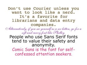
 Finding the best book font combinations for your printed books can be a challenge, but may be well worth the time and effort to find the ones that work best for you. Book publishing expert Teresa Miller discusses this topic in her recent post, where she also shares a list of top fonts and combinations from Douglas Bonneville.
Teresa says that one her personal “go-to” combinations is the first one on Bonneville’s list: Helvetica (bold) for chapter titles and Garamond for body content.
I have written all of my print books (nine to date) using the Georgia font throughout. Now I can see that I have limited myself with this choice and intend to be more creative with my next book (due out in October, 2014).
Which fonts are you using in your printed writing, and why do you prefer those to the more traditional font combinations?

Leave a Reply
You must be logged in to post a comment.